
Uncovering Interesting Facts about Grid-based Web Design
Web Design industry has seen a lot of trends come and go lately. While some have really impressed the web designers, others have disappointed them. From among the wide array of web design trends flooding in the market, we decided to pen down details on grid-based web design to make you aware about what exactly it is and why web designers increasingly prefer it over other design trends. So, let’s unleash interesting facts about this technique.
Defining Grid in terms of web design WWW gives preference to grids Grids allow exploring possibilities • How wide should the measurement be? • How should be the placement of folios?
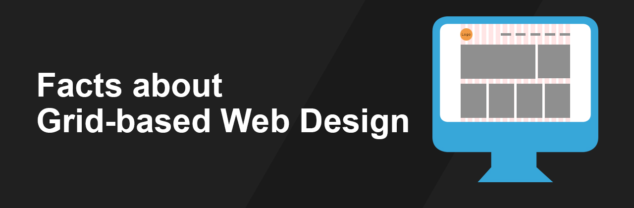
Grid is basically a series of horizontal and vertical lines positioned at regular intervals. The grid is useful in web designing as it helps creating an order. The style is best for those who want to have a cleaner and organized look of their website.
Web standards change with time and with presently, World Wide Web is giving a special preference to the sites developed with grid format. With so many efficient CSS-based grid frameworks like Blueprint and 960, it has become quite easy for the designers to create incredible websites in less time duration. Although, there are many web designers that still need to realize the potential of grid based design.
Some web designers have wrong notion about grid based design that they restrict realization of their creative side while designing. But the real fact is that grids can actually facilitate creativity by rendering them a framework that is not only easy to use but suitable to meet a wide variety of web designing requirements. In fact, it helps the web designers to find answers for questions like:
Above all, grid allows strengthening of layouts and streamlining the complete website development process that eliminates any future modifications issues. With easy access to large amount of information in the form of documents and other resources, one can easily create a web design that is not only unique but full of eye-catching effects. Choosing a base unit for measurement
It’s crucial to choose a base unit for the layout before getting started with the grid-based web design. Taking pixels as the base unit of measurement is preferable, but since individual pixels are too small to create a grid, the designer needs to align the items at a 100% scale.
File creation and baseline grid set-up
File creation and set up of baseline grid requires perfection. In fact, Fireworks offer an interesting and simplified panel which lets the designer control the properties of grids. As an example, it allows easy editing of colors.
When you are creating a new file for web layout, it’s important to take into account the width of the canvas; and it is preferable to go with the fixed width way. This is because it offers a greater control over the measurement and no. of characters available within each line in a column. As of the layouts, they should be limited to approximately 960 pixels in width. This will easily accommodate in 1024 x 768 screen resolution which is a common screen size.
Finally
Integrating grid-based web design approach in web development ensures a way to build websites that are flexible and rich in graphics and functionalities. Grid-based design is strongly backed up by stability and visual strength that will surprise you with its outcomes, no matter what type of website you are designing.

